My mission as Product designer ?

For almost 3 years, I have been a product designer for Mediabox, a set of workflow management tools specialized in artwork creation.

  • Prepare and conduct user research (interviews, quantitative analysis, data management)
  • Organize workshops with different teams (Tech, Business analysts, Testers...)
  • Create and maintain a design system (UI toolkit Figma, tone of voice, graphic chart...)
  • Create and maintain a bootsrap components library for the development team
  • Preparation of Figma mockups and prototypes
  • Implementation of user tests
  • Manage user behavior analysis tools
  • Evolve the roadmap according to the insights gathered

A small overview of our design system Mediabuild

Graphic chart & toolkit for Mediabox

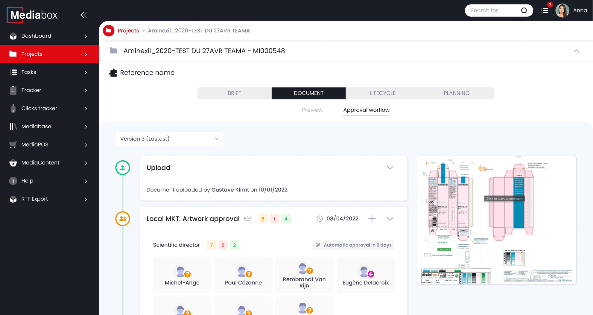
Mediabox is a web application primarily desktop, which uses mainly black, white and an action color, blue. A customizable color and preferably bright color, makes our interface nice to use.

Color codes

main colors

#3699FF
primary
#E1F0FF
light-blue
#DF0A14
Default UI
#1A1D26
text-dark
#3F4254
text-dark-75
#A3A6BA
text-muted
#FFFFFF
white

Technical colors

#FF4252
red
#0ACF83
green
#FF8D00
orange
#B7B7B7
grey
#D0E8DD
not started
#FFEDEC
bg-red
#E9F8E9
bg-green
#FFF4E4
bg-orange
#F6F6F6
bg-grey-medium

Background colors & borders

#F5F8FD
bg-main
#F4F2F3
light-grey
#FAFAFA
bg-ultra-light-grey

Fonts

Our typography is Poppins. It is clean and rounded, for a very soft visual set

XXL
32px
XL
22px
L
16px
M
13px
S
11px

Size

Pages content uses L, M and S most of the time. XL and XXL are reserved for special elements such as welcoming the user on the dashboard page

Bold
700
Medium
500
Regular
400
Thin
300

Weight

Pages content uses Regular for text and Medium for titles. Bold is used for the table headers, while thin is rarely used, but can help when the interface gets overwhelmed

Themes

Mediabox offers two themes, light and dark, to be combined with the UI color chosen by the customer

Light
Dark

Figma UI Toolkit small overview

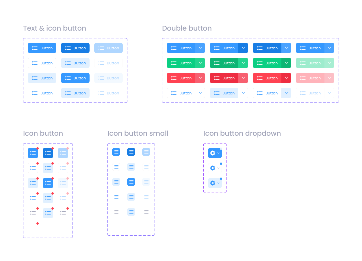
Our UI toolkit uses the last functionalities of Figma and was created with the atomic design methodology. Each component has its equivalent in our bootstrap library.

Focus on few pages of our tool

Mediabox has more than 50K users. We conduct user interviews all year long to define the points of improvement and work on redesigns. In addition, we have user behavior analysis tools to collect quantitative data.
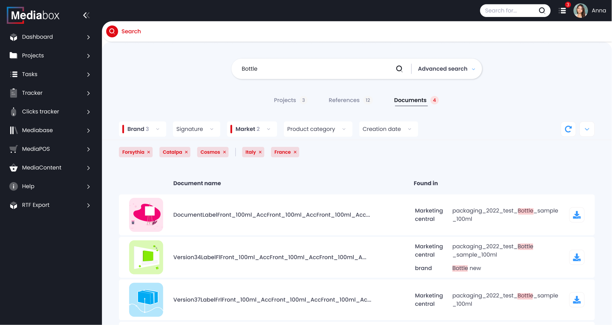
Mazdabox - Web content editor - Figma embed

Design process - FigJam embed